chatviz.plotting.plot_days_radar
- chatviz.plotting.plot_days_radar(df, ax=None, colors='default', legend=False)
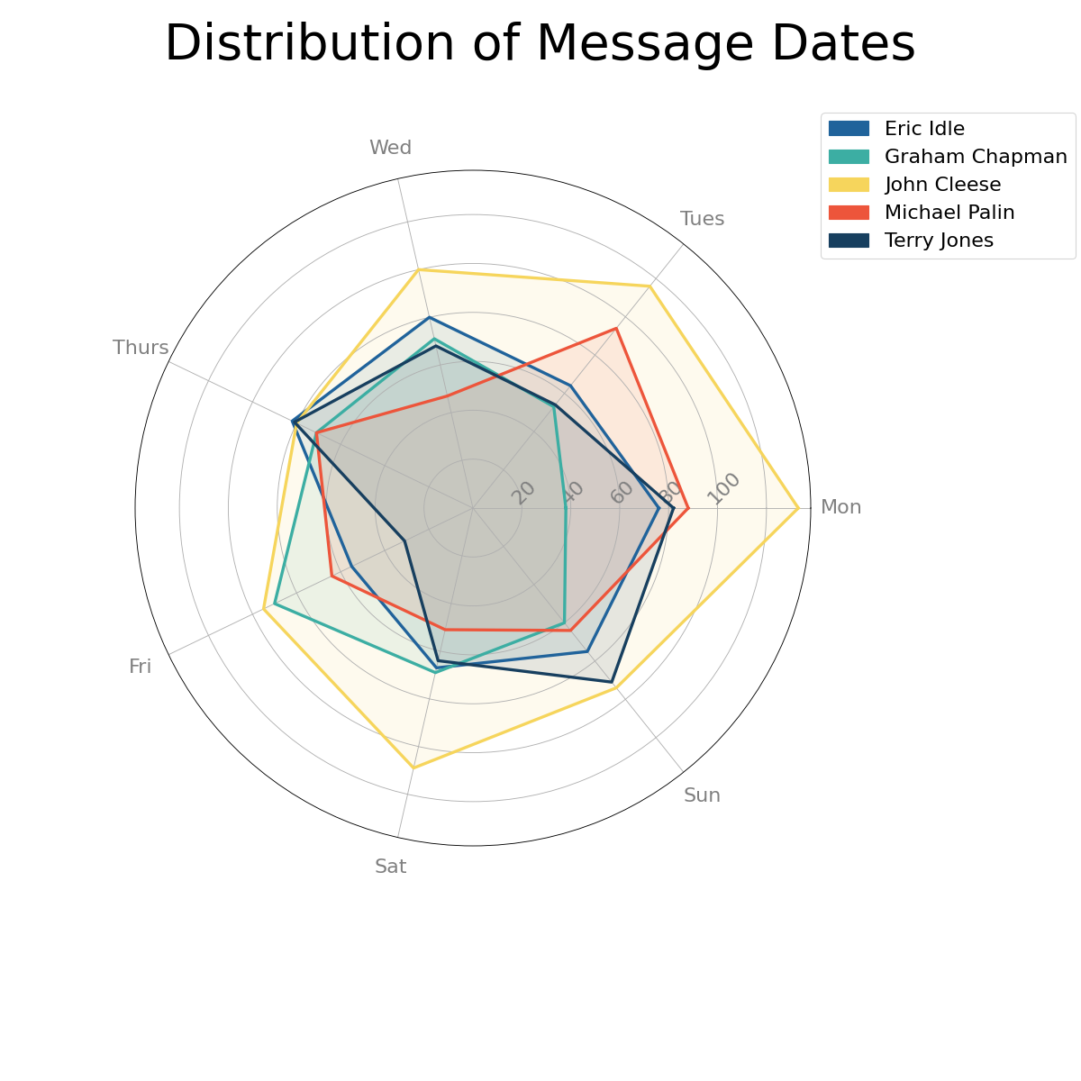
Creates a radar plot showing the number of messages per day for each person in the chat.
- Parameters
- dfpd.DataFrame
The dataframe of messages. Must have the columns [‘name’, ‘date’].
- axplt.Axes or None
This should be a polar axes. If None (default), one will be created with ax = plt.subplot(polar=True).
- colors{‘default’} or list of str or dict
The colors to be used for each person in the chat. Should be either ‘default’ in which case the default color scheme is used, a list of colors the same length as the number of names in df[‘name’], or a dict which maps each name to a color. For more info about color options, see here.
- legendbool
If True, will add a legend to the plot. Default is False.
- Returns
- matplotlib.axes._subplots.PolarAxesSubplot
A radar plot with one area per person in the chat.
See also
Examples
This example shows how to create a radar plot showing how many messages are sent on each day by each chat participant. It shows that for this dummy dataset, John Cleese sends most of his messages on a Sunday, whereas Michael Palin sends most of his on a Monday.
from chatviz.utils import load_example_chat_data
from chatviz.plotting import plot_days_radar
import matplotlib.pyplot as plt

plt.rcParams["figure.figsize"] = [15, 15]
plt.rcParams["font.size"] = 20
plt.rcParams["axes.titlesize"] = 40
plt.rcParams["font.family"] = "Sawasdee"
plt.rcParams["legend.loc"] = "upper left"

df = load_example_chat_data()
palette = ["#20639B", "#3CAEA3", "#F6D55C", "#ED553B", "#173F5F"]
plot_days_radar(df, colors=palette, legend=True)

legend = plt.gca().get_legend()
legend.set_bbox_to_anchor((1.0, 1.1))  # move the legend to the right

plt.suptitle("Distribution of Message Dates", size=50)
plt.subplots_adjust(top=0.95, wspace=1.0, right=0.75)
plt.show()
(Source code, png, hires.png, pdf)