chatviz.plotting.plot_reply_times
- chatviz.plotting.plot_reply_times(df, ax=None, colors='default', show_ylabels=False)
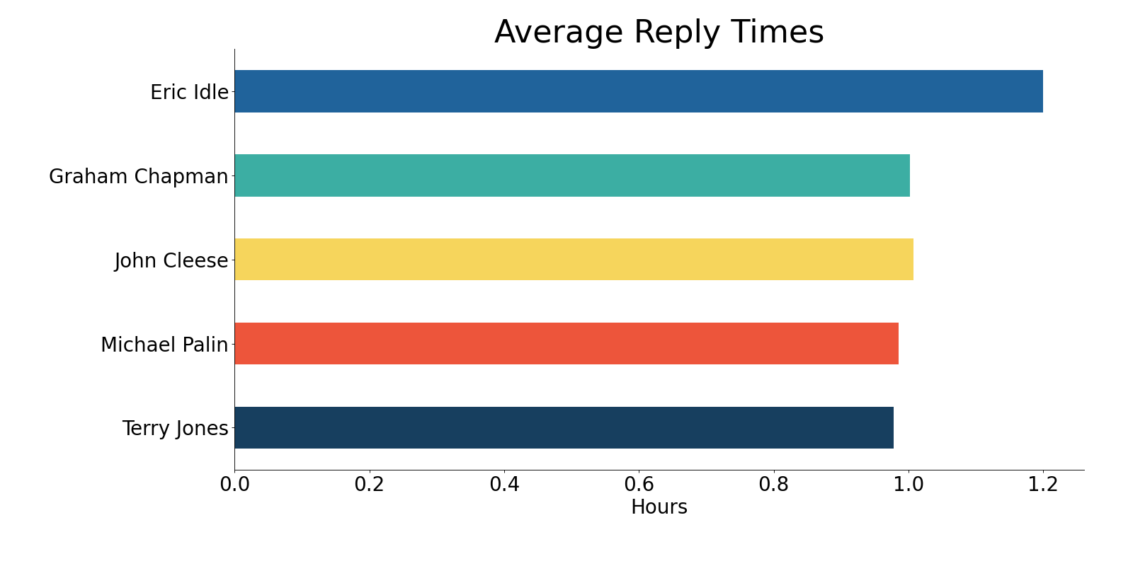
Creates a horizontal bar chart showing the average reply time in hours for each person in the chat.
Reply time for person A is calculated as the time at which a message was sent minus the time of the last message sent by someone other than person A.
- Parameters
- dfpd.DataFrame
The dataframe of messages. Must have the columns [‘date’, ‘name’].
- axplt.Axes or None
The axes to plot onto. If None (default), will create a new axes.
- colors{‘default’} or list of str or dict
The colors to be used for each person in the chat. Should be either:
‘default’ in which case the default color scheme is used
a list of colors the same length as the number of names in df[‘name’]
or
a dict which maps each name to a color.
For more info about the possible color strings, see the matplotlib documentation.
- show_ylabelsbool
If True, will show names around the donut. If False (default), then they will be hidden.
- Returns
- plt.Axes
The horizontal bar chart axes plot.
Examples
from chatviz.utils import load_example_chat_data
from chatviz.plotting import plot_reply_times
import matplotlib.pyplot as plt

plt.rcParams["figure.figsize"] = [20, 10]
plt.rcParams["font.size"] = 25
plt.rcParams["axes.titlesize"] = 40
plt.rcParams["font.family"] = "Sawasdee"

df = load_example_chat_data()
palette = ["#20639B", "#3CAEA3", "#F6D55C", "#ED553B", "#173F5F"]
plot_reply_times(df, colors=palette, show_ylabels=True)
plt.tight_layout(pad=2.5)
plt.title("Average Reply Times")
plt.show()
(Source code, png, hires.png, pdf)