chatviz.plotting.plot_timeline
- chatviz.plotting.plot_timeline(df, ax=None, freq='MS', colors='default', tick_format="%b '%y", tick_step=6, stacked=False, legend=False)
Creates a bar chart of number of messages over time.
The size of the bins in the bar chart can be adjusted via freq, and there are other options to control whether or not to create a stacked bar chart. See the examples below for more information.
- Parameters
- dfpd.DataFrame
The dataframe of messages. Must have the columns [‘date’, ‘text’], as well as a ‘name’ columns if stacked=True.
- axplt.Axes or None
The axes to plot onto. If None (default), will create a new axes.
- freq: str
The offset string for the resample frequency. See the pandas documentation for all options. The default is ‘MS’, which will generate a monthly plot.
- colors{‘default’} or str or list of str or dict
The colors to be used for each person in the chat. Should be either:
‘default’ in which case the default color scheme is used.
a list of colors the same length as the number of names in df[‘name’] when stacked=True.
a single color string when stacked=False.
or
a dict which maps each name to a color.
If stacked=False and multiple colors are passed, then the first one will be used. For more info about the possible color strings, see the matplotlib documentation.
- tick_formatstr
The format string for the x tick labels, which are dates. The default is ‘%b ‘%y’ which gives for example Jan ‘19. For more information about datetime format strings, see the datetime documentation.
- tick_stepint
The number of steps between the ticks on the x-axis. By default this is 6, so every 6 bars will have an x-tick label.
- stackedbool
If True, then a stacked bar chart will be created, with one color per person involved in the chat. If False (default), will just plot one colored bar with the overall count.
- legendbool
If True, will add a legend to the plot when stacked=True. Default is False.
- Returns
- plt.Axes
The bar chart axes plot.
Examples
This first example shows how to plot a stacked timeline with each bar being 2 days, and every third bar having a label on it, which is formatted as day/month/year.
from chatviz.utils import load_example_chat_data
from chatviz.plotting import plot_timeline
import matplotlib.pyplot as plt

plt.rcParams["figure.figsize"] = [20, 10]
plt.rcParams["font.size"] = 20
plt.rcParams["axes.titlesize"] = 40
plt.rcParams["font.family"] = "Sawasdee"

df = load_example_chat_data()
palette = ["#20639B", "#3CAEA3", "#F6D55C", "#ED553B", "#173F5F"]
plot_timeline(
    df,
    stacked=True,
    legend=True,
    freq="2D",
    tick_format="%d/%m/%y",
    tick_step=3,
    colors=palette,
)
plt.legend(bbox_to_anchor=(1.05, 1), loc="upper left", borderaxespad=0.0)
plt.tight_layout()
plt.show()
(Source code, png, hires.png, pdf)

The second example shows how the frequency can be change to plot weekly bars, with the labels now being on every bar and showing the week number and year.
from chatviz.utils import load_example_chat_data
from chatviz.plotting import plot_timeline
import matplotlib.pyplot as plt

plt.rcParams["figure.figsize"] = [20, 10]
plt.rcParams["font.size"] = 20
plt.rcParams["axes.titlesize"] = 40
plt.rcParams["font.family"] = "Sawasdee"

df = load_example_chat_data()
palette = ["#20639B", "#3CAEA3", "#F6D55C", "#ED553B", "#173F5F"]
plot_timeline(
    df,
    stacked=True,
    legend=True,
    freq="W",
    tick_format="Week %W, %Y",
    tick_step=1,
    colors=palette,
)
plt.legend(bbox_to_anchor=(1.05, 1), loc="upper left", borderaxespad=0.0)
plt.tight_layout()
plt.show()
(Source code, png, hires.png, pdf)

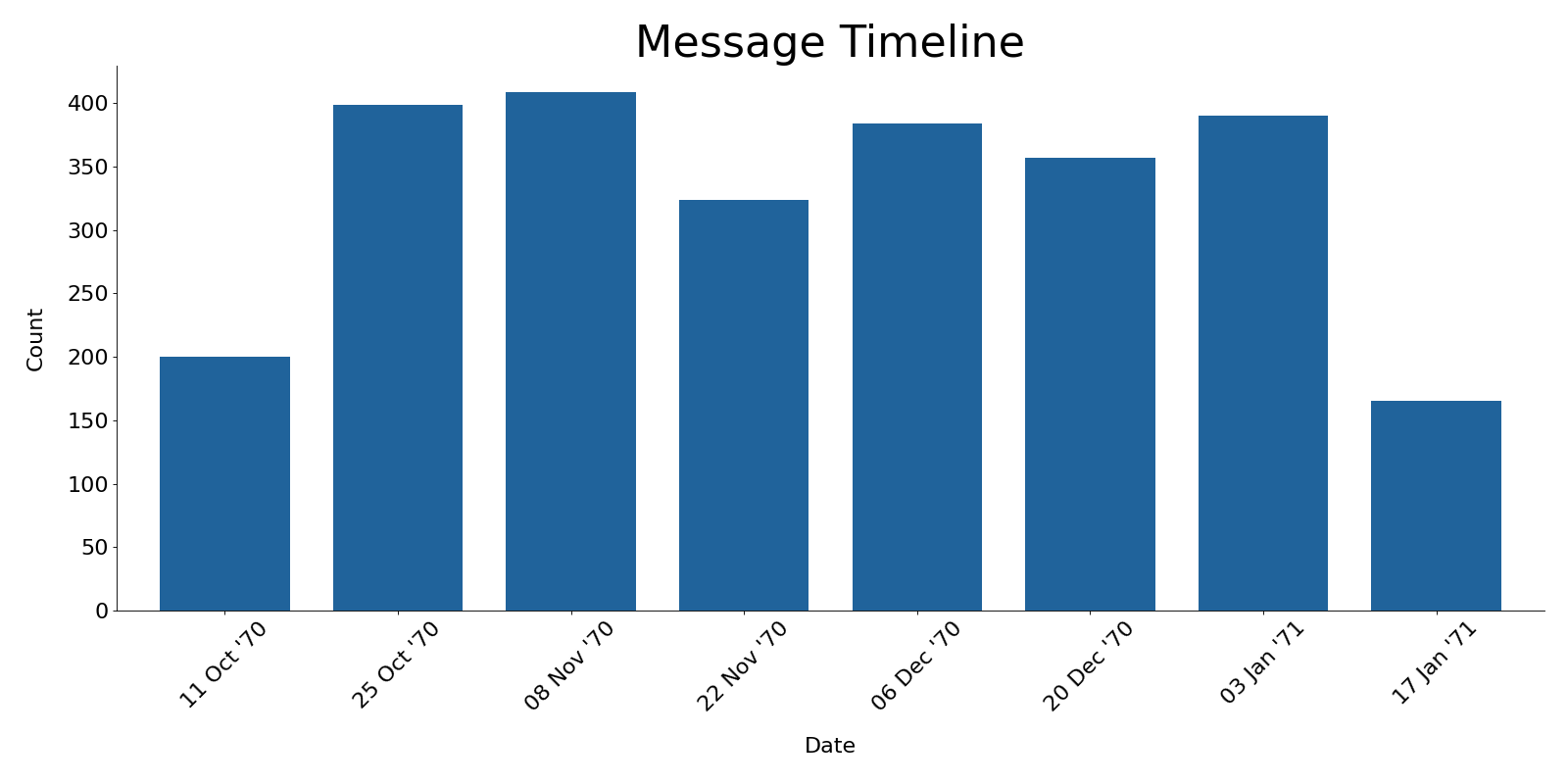
The third example shows the plot with stacked=False, so the bars are only in one color.
from chatviz.utils import load_example_chat_data
from chatviz.plotting import plot_timeline
import matplotlib.pyplot as plt

plt.rcParams["figure.figsize"] = [20, 10]
plt.rcParams["font.size"] = 20
plt.rcParams["axes.titlesize"] = 40
plt.rcParams["font.family"] = "Sawasdee"

df = load_example_chat_data()
plot_timeline(
    df, stacked=False, colors="#20639B", tick_step=1, freq="2W", tick_format="%d %b '%y"
)
plt.tight_layout()
plt.show()
(Source code, png, hires.png, pdf)
Note
You may need to alter the font sizes and other parameters using plt.rcParams to get a suitable plot.